BRIEF Columbia University’s International Students and Scholars Office (ISSO) is an important immigration office housed within the central university. I was tasked to redesign the entire website in a year’s time. ROLE
|
|
PROCESS |
|
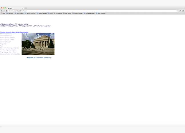 |
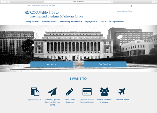
The yearlong project started by doing an intensive content analysis. The picture to the left shows the original homepage. |
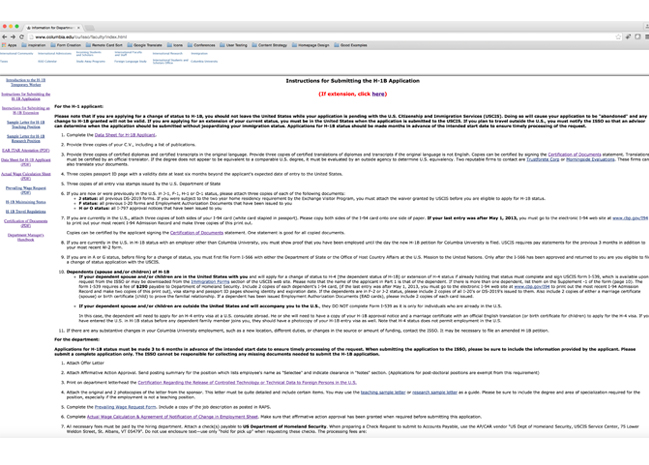 |
Upon reviewing the content, I realized that the text itself was quite detailed. The main challenge would be translating it to be more mobile and user friendly. |
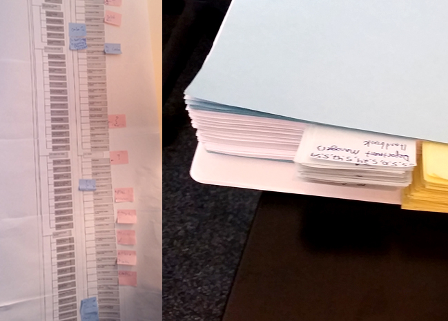 |
I began by printing out all Web pages so that my supervisor and content editor-in-chief could begin re-writing. On order to inform the content, however, I wanted to start by developing the IA. This way, we could get a better understanding of what we had and also how to categorize any new content. |
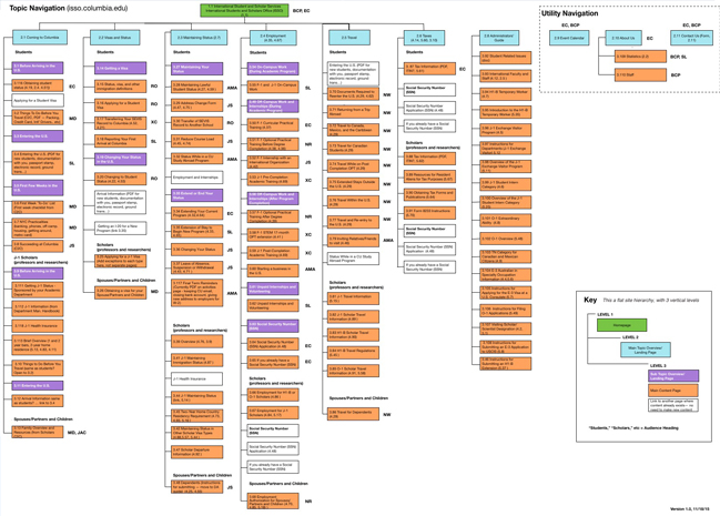 |
When designing the IA, our goal was to create a very “flat” architecture. This is because the original site was extremely deep, so much so that it was hard to find information. We managed to succeed, but would it work? |
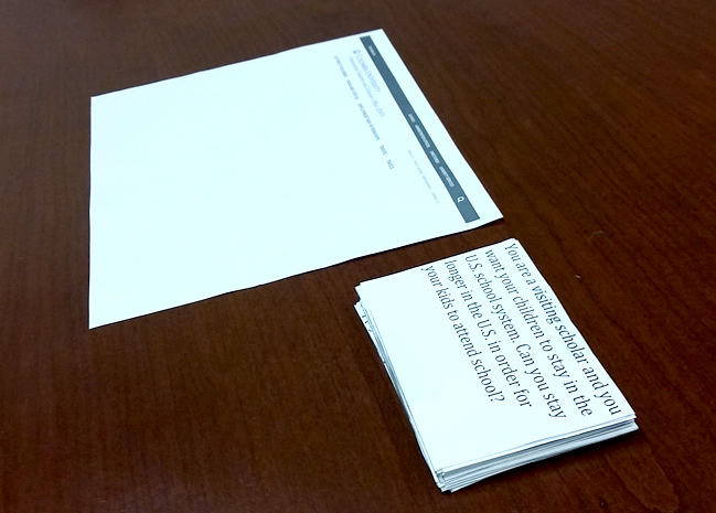 |
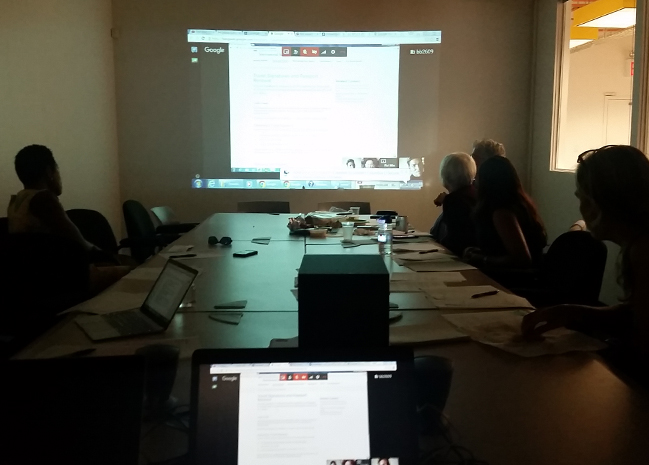
To confirm our hunch was correct, we decided to test the site with actual users. I created a card sorting activity where we asked international students, scholars, and academic departments a few scenarios and asked them based on our navigation where they expected to find the info. |
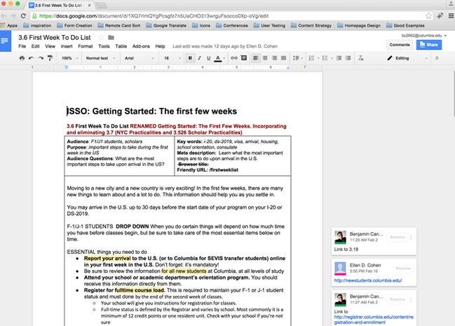 |
The initial tests were successful so we moved forward. We developed a team of stakeholders to be content editors and distributed the pages evenly. We created Google docs with space for content, notes, image ideas, SEO text, and more. |
 |
While the 3 months of content editing were under way I began working on design and wireframes. I worked with the central UX lead to get framework and style sheets. |
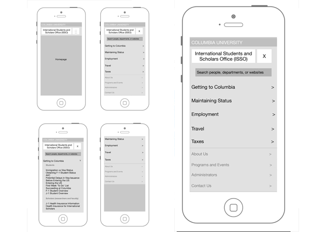 |
Another important aspect of the project was to make the website mobile-friendly. I worked with the central UX team to develop our menu. |
 |
After 9 months of development (and about a month before launch) we conducted hour-long user tests with users from our three main audiences. We were thrilled to see users finding information very quickly. |
RESULTS |
|
 |
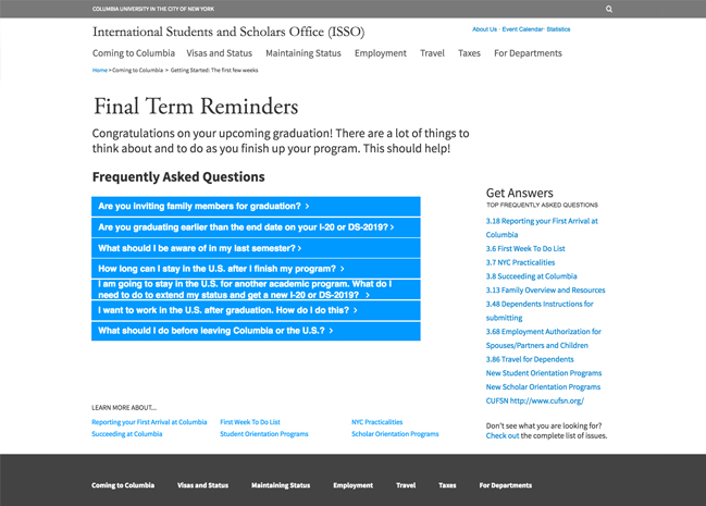
The launch of the new website was met with great joy. Users called, emailed, and thanked us in-person for the new site. The homepage was now clearly organized with clear titles and headings. We worked with content experts and user data to use the homepage as a “living” page where sections and topics could easily be updated depending on the time of year. |
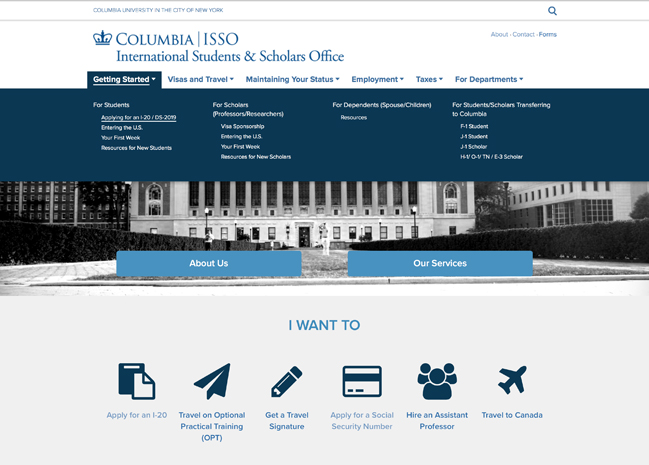 |
There was also a drop down menu broken down by audience. Luckily, we were able to keep the architecture flat. Thus, the site was organized by topics. This allowed user to more quickly identifY. |
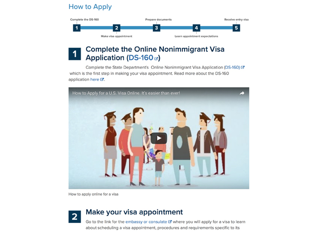 |
Another achievement of the site was creating very clean pages with clear “how to guides.” Since most of our site is comprised of directions and instructions. We used time line and numbered step imagery to help users understand their processes. The formatting also allowed us to enter instructional videos. |
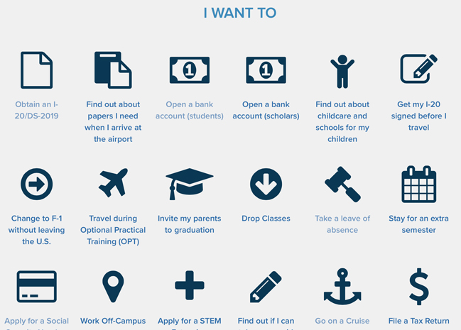 |
We also integrated a services features developed by the central IT. This featured included nearly 100 font awesome icons for us to use. We collected an archive of our services and so the user can click thru them to be sent to their location. |
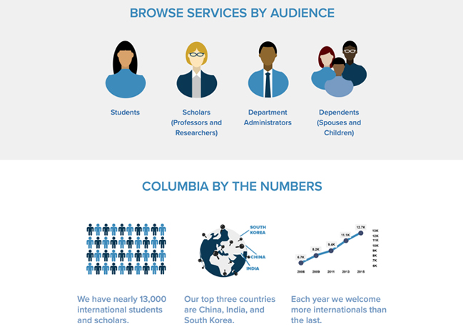 |
To help identify audiences, we also created audience pages to help the user find the services that apply to them. In addition, we also developed visual statistics to give context to our growing population and data. |
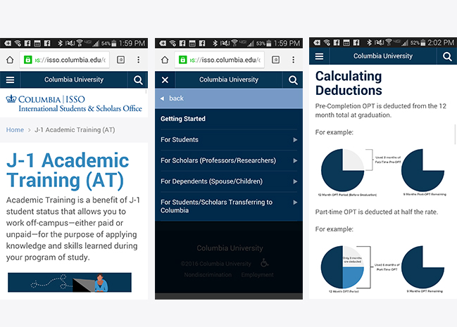 |
Finally, per our original wireframes, we developed the site to be 100% mobile friendly. This hamburger menu and adjustable template made the site seamless to mobile/tablet. |
Columbia University Website
